Configuring the Navigation Widget
The Navigation widget enables you to place a vertical or horizontal navigation bar on a page or template. The widget automatically generates links to sections, section links, and external links on one or more levels of a site to create a navigation bar. You can configure certain properties of the navigation bar such as how many levels of navigation links it can include and whether it is horizontal or vertical.
The Navigation Widget does not have an associated asset type, and you cannot open or edit it through a form or editor. You can change formatting and style by editing its configuration properties.
For navigation consistency throughout your site, Percussion recommends you place navigation widgets on templates rather than pages.
Widget Configuration Properties
Max Levels - Maximum number of levels of navigation links that can appear in the navigation bar. Default is 3.
Root Level - The site level that the navigation bar uses as its first level. If you enter a site level higher than the page's site level, the widget cannot create a navigation bar. Default is 1.
| If you enter a Root Level of . . . | The navigation bar shows . . . | |
| 1 (default) | The home page (first site section level) and the second level of site sections in the first level of navigation. The descendants of the second level of site sections in its following levels. | |
| 2 | The second level of the site's sub-sections in the first level of navigation. The descendants of the second level of sections in the following levels. |  |
| 3 | The third level of the site's sub-sections in the first level of navigation. The descendants of the third level of sections in the following levels. | 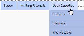 |
| 4 | The fourth level of the site's sub-sections in the first level of navigation. The descendants of the fourth level of sections in the following levels. | |
| 5 | Nothing. You cannot enter a root level that is two or more levels higher than the sub-section level. |
Layout - Drop list of layout options for the navigation bar. Options are:
- horizontal - Gives the navigation bar a horizontal structure. Site visitors can move their cursors over links to view sub-levels of navigation links.
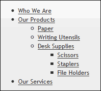
- vertical - Gives the navigation bar a vertical structure. By default, maximum level of links are shown.
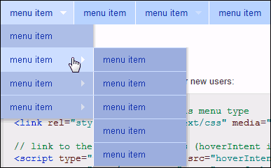
- horizontal rollover - (default) Gives the navigation bar a horizontal structure. Site visitors can move their cursors over links to view sub-levels of navigation links.
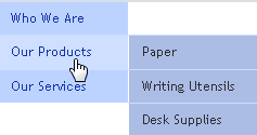
- vertical rollover - Gives the navigation bar a vertical structure. Site visitors can move their cursor over links view sub-levels of navigation links.
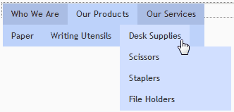
- navbar rollover - Gives the navigation bar a horizontal structure in which two levels of links are always visible. By default, the second level displays sub-section links of the current page link, but site visitors can move their cursors over other top-level links to display their sub-section links in the second level. At any level, site visitors can move their cursor over links to view their sub-links.
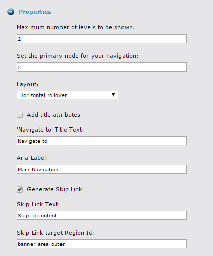
- Checking off this box will add the title="<Link Title>" attribute to each link in your navigation bar
- This is the text that you want your nav element to have
- This is where you define your aria label name for accessibility purposes.
- As an example, you would enter Main Navigation for a header navigation, or enter Secondary Navigation for a side bar navigation.
Generate Skip Link
- Checking off this box will generate a "Skip Link" which is necessary to have a fully accessible website
- A Skip Link allows users using screen readers to skip over your navigation bar so that they don't have to have it read aloud for each page they navigate to on your website
Skip Link Text
- This is where you enter the text that you want your Skip Link to read - example: Skip to content
Skip Link target Region ID
- This is where you enter the name of the region that you want people to be able to skip to if they select the Skip Link. No # is needed when entering this region ID.
Widget Style Properties (Style Tab)
CSS Root Class - Text box for entering the name of a custom CSS class to format the navigation bar. Your site designer can supply you with the name of the class.
Customizing Entries in a Navigation Bar
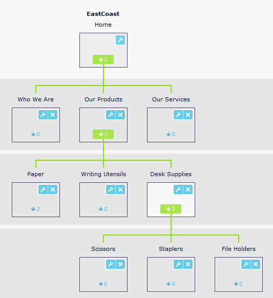
You can customize the appearance of each entry in a navigation bar by adding custom formatting to classes that you add to its theme. The classes enable you to select specific navigation sections within your site, and the formatting they define is applied to the corresponding entries in the navigation bar. To explain how these classes work, we will use examples from the East Coast site's navigation tree shown at the top of this page.
The classes for formatting navigation entries are:
- nav-level-n - The horizontal navigation level. For example, nav-level-1 includes the entry Home, and nav-level-2 includes the entries Who We Are, Our Products, and Our Services.
- list-position-n - The vertical position of an entry relative to its siblings (siblings are all entries at the same level branching from the same parent node). list-position-n is not level dependent; for example all sections with at least 2 sub-sections contain a list-position-2 entry. For the sample site, Our Products, Writing Utensils, and Staplers are all list-position-2 entries. Note that list-position-1 includes Home.
- nav-entry-n - The position of an entry relative to the other entries at the same horizontal level. In the example, Desk Supplies is nav-entry-3. If another sub-entry is added to Our Products, and it is inserted before Desk Supplies, then Desk Supplies becomes nav-entry-4.
You can also specify a single navigation link. For example, nav-level-2 list-position-2 would specify the Our Products entry.
To use these classes, add them to your theme:
- Open your theme for editing. Either modify the site theme's CSS files directly or edit a template theme's CSS file.
- Add CSS for styling elements. Each time you want to view a style change in your theme file, refresh your browser.
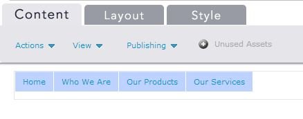
The syntax for defining element styles is: .sf-menu li.[custom format class name] a {[property] : [value]} - In this example, our original navbar appears with all blue links:
- We want to make the second level of links green. To specify the second level we use nav-level-2.

- Click [Save].
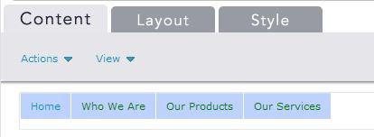
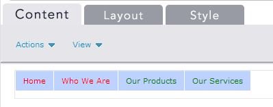
- To check your results, open an item that uses the customized navbar and displays a second level. The level two entries are green, which is what we specified. Home is blue because it is a first level entry.
- To keep the second level entries green and make all first siblings and Home red, we use list-position-1. Edit the theme file with the following CSS:

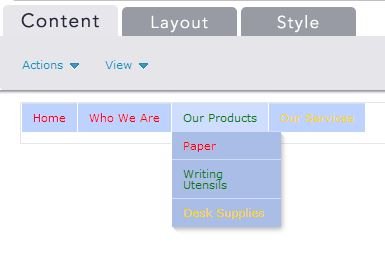
Since list-position-1 includes Home, it is red, and since Who We Are is a first sibling, it is red. - Now, to show how nav-entry-n works, we will make the third entry in each level shown on the list gold. We add the following CSS to our theme:

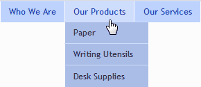
Although Our Services appears fourth in our navigation bar, it is actually the third entry in its level, so it is gold. If we hover our cursor over Our Products, we see the level under it, and the the third entry, Desk Supplies, is gold.
