Styling Rollover and Vertical Navigation
Styling Rollover Navigation
The horizontal rollover and vertical rollover options on the navigation widget generate menus that display the top level of the navigation by default, and display additional levels as you mouse over an item that has children. When developing theme CSS for rollover navigation, you must create styles for:
- the changing state of the menu items as you mouse over and select different options; and
- sizing of the menu items and the resulting offset of lower levels of navigation.
Styling Navigation Boxes
Three styles may apply to a navigation box, although only one of these styles should apply at any specific time:
- Default
The normal styling on the box when the mouse is not over the box itself or one of the children of the menu entry. - Selected
The styling applied to the box when the mouse is hovering over it. - Expanded
The styling applied to the box when the mouse is over one of the children menu entries.
Depending on your design, you may only need to define styles for a subset of these states.
The selectors for default styling is basic: select on the list item (<li>) and anchor (<a>); for example, the default selector for the top level of navigation is .sf-menu li a. The selectors for additional levels of navigation select on elements nested in the top navigation list item. For example, the default selector for the second level of navigation is .sf-menu li li a.
To style an entry when the mouse is hovering over it, create a selector with the :hover pseudo-class applied to the anchor element; for example, the selector for the rule applied when the mouse is hovering over an entry in the top level of navigation is .sf-menu li a:hover. The selectors for additional levels nest in the same manner as the default selectors nest, with the :hover pseudo-class applied to the final level in the selector. For the example, the selector for the rule to apply when hovering over an entry in the second level of navigation is .sf-menu li li a:hover, while the selector for the third level is .sf-menu li li li a:hover.
Styling an entry when the mouse is hovered over a child menu entry also uses the :hover pseudo-class, but applied to the list item (<li>) element rather than to the anchor element; for example, to style the top level of navigation when the mouse is hovered over one of its child menu entries, use the selector .sf-menu li:hover a. Again, the selectors for additional levels nest in the same manner as the default state, with the :hover pseudo-class applied to the final nested level. Thus, to style a second-level entry when hovering the mouse over one of its child entries, use the selector .sf-menu li li:hover a.
Horizontal Rollover Example
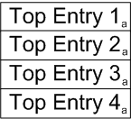
To illustrate these selectors in action, start with the following example top navigation, with the default rule for the top level applied. These items, designated by the letter "a" in the following graphic, use the following selector:.sf-menu li a):
![]()
| Key | Description | CSS Rule |
| a | top level default | .sf-menu li a {background-color: white; font-size: 14pt;} |
When the mouse is moved over Top Entry 2, it is selected and uses the rule for a selected entry. All other entries in the top level (designated "a" in the following graphic) continue to use the default top-level styling rule. In addition, the second-level entries (designated "c" in the graphic) are rendered using the default rule for the second level:

| Key | Description | CSS Rule |
| a | top level default | .sf-menu li a {background-color: white; font-size: 14pt;} |
| b | top level selected | .sf-menu li a:hover {background-color: darkgreen; font-size: 12pt;} |
| c | second level default | .sf-menu li li a {background-color: royalblue; font-size: 12pt;} |
When the mouse is moved over Second Entry 2, the following changes occur:
- Top Entry 2 (designated "d" in the graphic below) changes to use the top-level rule for expanded entries. All other top-level entries (designated "a" below) continue to use the default top-level rule.
- Second Entry 2 (designated "e" below) uses the second-level selected rule. All other second-level entries (designated "c" below) continue to use the default second-level rule.
- All third-level entries (designated "f" below) are rendered using the default third-level rule.

| Key | Description | CSS Rule |
| a | top level default | .sf-menu li a {background-color: white; font-size: 14pt;} |
| c | second level default | .sf-menu li li a {background-color: royalblue; font-size: 12pt;} |
| d | top level expanded | .sf-menu li:hover a {background-color: limegreen; font-size: 12pt;} |
| e | second level selected | .sf-menu li li a:hover {background-color: dodgerblue; font-size: 12pt;} |
| f | third level default | .sf-menu li li li a {background-color: darkorange; font-size: 12pt;} |
Finally, when the mouse is moved over Third Entry 2, these changes occur:
- Second Entry 2 changes to use the second-level expanded rule.
- Third Entry 2 changes to use the third-level selected rule.

| Key | Description | CSS Rule |
| a | top level default | .sf-menu li a {background-color: white; font-size: 14pt;} |
| c | second level default | .sf-menu li li a {background-color: royalblue; font-size: 12pt;} |
| d | top level expanded | .sf-menu li:hover a {background-color: limegreen; font-size: 12pt;} |
| e | second level selected | .sf-menu li li a:hover {background-color: dodgerblue; font-size: 12pt;} |
| f | third level default | .sf-menu li li li a {background-color: darkorange; font-size: 12pt;} |
| g | third level selected | .sf-menu li li li a:hover {background-color: wheat; font-size: 12pt;} |
Vertical Rollover Example
Vertical rollover navigation works the same way as horizontal rollover. For example, in the following illustration, the configuration on the navigation widget was changed to vertical rollover, which renders the entries vertically, but uses identical rules to the default rules for the horizontal rollover. The entries, again designated by the letter "a", use the selector:.sf-menu li a):

| Key | Description | CSS Rule |
| a | top level default | .sf-menu li a {background-color: white; font-size: 14pt;} |
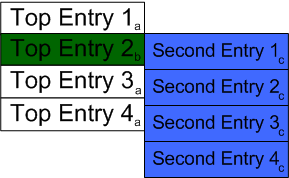
Moving the mouse over Top Entry 2 (designated "b") applies the selected rule (.sf-menu li a:hover), and renders the second level (designated "c") using the default rule for second-level entries.

| Key | Description | CSS Rule |
| a | top level default | .sf-menu li a {background-color: white; font-size: 14pt;} |
| b | top level selected | .sf-menu li a:hover {background-color: darkgreen; font-size: 12pt;} |
| c | second level default | .sf-menu li li a {background-color: royalblue; font-size: 12pt;} |
The remainder of the styling follow the pattern described above for horizontal rollover styling.
Sizing Navigation Boxes
Selectors for navigation boxes select on the navigation list item:
.sf-menu li
. Specifying the correct size and offsets for the list items is important. The top offset of a lower-level navigation must match the total height of its immediate parent. In the CSS box model, the total height includes:
- height + border + margin + padding
Moreover, it includes both the top and the bottom. So when setting the vertical offset of the second level of a drop navigation, the offset is the total of:
- height + border-top + border-bottom + margin-top + margin-bottom + padding-top + padding-bottom
If you define a single border, margin, or padding, double that size to account for both top and bottom.
For example, if you define the following sizing for a top navigation box:
.sf-menu li {
     height: 50px;
     padding-top: 5px;
     padding-bottom: 5 px;
     border-top: 1 px;
     border-bottom: 1 px;
     margin-top: 5px;
     margin-bottom 5px;
}
Define the vertical offset for the second level of navigation in the following manner:
.sf-menu li:hover ul {top: 72}
The following graphic illustrates the box model for this example top-level navigation entry, and the resulting vertical offset for the second-level navigation:

Note that the width of the second level of navigation is not as important as the vertical offset. It is common for the second level of navigation to be wider than the top level.
When defining the offset and sizing for a third level of navigation the concerns are reversed; the horizontal offset must be defined accurately, while the vertical sizing is not as crucial. The offset is the total of
- width + border-right + border-left + margin-right + margin-left + padding-right + padding-left
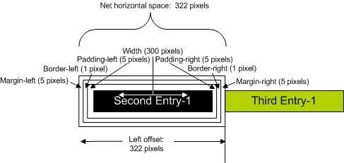
So if you define a second-level navigation box with the following styling:
.sf-menu li {
     width: 300px;
     padding-left: 5px;
     padding-right: 5px;
     border-left: 1px;
     border-right: 1px;
     margin-left: 5px;
     margin-right 5px;
}
the horizontal offset for the third level of navigation would be:
.sf-menu li:hover ul {left: 322}
The following graphic illustrates the box model for this example second-level navigation entry, and the resulting horizontal offset for the third-level navigation:

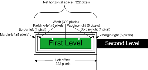
Vertical rollovers always expand horizontally, so you only need to define horizontal offsets for the second and third levels. Thus assuming a top level defined as
.sf-menu li {
     width: 300px;
     padding-left: 5px;
     padding-right: 5px;
     border-left: 1px;
     border-right: 1px;
     margin-left: 5px;
     margin-right 5px;
}
the second level should be defined with a horizontal offset of 322 pixels:
.sf-menu li:hover ul {left: 322}
as illustrated below:
Styling Vertical Navigation
To create a vertical navigation bar, choose Vertical in the Layout field of the navigation widget configuration. When you choose this configuration, CM1 adds two CSS classes that you can use to style the navigation:
- perc-navbar-vertical
CM1 adds this class to the root unordered list (<ul>) of the navigation:

- current
CM1 adds this class to the list item of the navigation section that includes the current page, as well as to each of the list items that represents a parent section in the navigation.
Styling a Vertical Navigation Bar
When styling the contents of a vertical navigation bar, use the .perc-navbar-vertical class in your selector. For example, the following rules create a simple vertical navigation bar with subordinate levels indented, as illustrated at the top of the page:
.perc-navbar-vertical {
    margin: 0;
    padding: 0;
}

.perc-navbar-vertical ul {
  list-style-type: none;
}

.perc-navbar-vertical ul ul {
    list-style-type: none;

}

ul.perc-navbar-vertical li li a {
  padding-left: 2em;
}

ul.perc-navbar-vertical li li li a {
 padding-left: 3em;
}
Styling Current Items in Vertical Navigation
If you want to have different treatment or styling for menu items in the navigation path of the current page, use the .current class. For example, a common practice is to hide lower levels of navigation unless the user is on a page in that section. By default, the menu is completely collapsed:

To hide the subordinate levels, use the display:none property on the subordinate list items:
/* Hide subordinate levels by default */
.perc-navbar-vertical ul li {display: none;}

.perc-navbar-vertical ul li li {display: none;}
When you click on a page that has contents in the next level of navigation, the parent expands to show its contents:

Since the current class is added to the top-level list item, we can display the second level of navigation by selecting on a list item that is a descendant of the .current class.
.perc-navbar-vertical .current li {display: block;}
To ensure that the lower-level contents remain hidden, add a selector that hides descendant list items of the last selector:
.perc-navbar-vertical .current li li {display: none;}
The complete block of rules is:
.perc-navbar-vertical .current li {display: block;}
.perc-navbar-vertical .current li li {display: none;}
Finally, when you click on a second-level navigation item, it expands to show the third level:

To display contents on the third level, build a selector that exposes the second level by also selecting on descendants of second-level items that have the .current class:
.perc-navbar-vertical .current li.current li {display: block;}
The complete style block is:
/* Hide subordinate levels by default */
*.perc-navbar-vertical ul li {display: none;}

.perc-navbar-vertical ul li li {display: none;}

/*Show second level when top level page has current class; keep third level hidden*/
.perc-navbar-vertical .current li {display: block;}

.perc-navbar-vertical .current li li {display: none;}

/* display third level when first and second levels are current */
.perc-navbar-vertical .current li.current li {display: block;}
