Using Twitter Bootstrap with Percussion CMS
When it comes to creating fast, clean and responsive web designs, there are plenty of open source front-end frameworks to choose from like YUI, ZURB, Jquery UI, HTML Kickstart, Twitter Bootstrap and many more. These frameworks provide the fastest and easiest way to build a brand new web front-end without having to write your CSS or Javascript from scratch. In addition, most of these frameworks already have built-in responsive design options.
The key to implementing a new front-end design to your website is being able to rapidly iterate and preview the new design without worrying about putting it into production. No one can afford to spend a month trying a new framework only to find it doesn't look as you hoped.
Here, we are going to show you how a responsive front-end framework, such as Twitter Bootstrap, can be implemented with Percussion CM1 and how you can start building fully responsive and clean web templates & pages in matter of minutes.
Step 1: Download Twitter Bootstrap. Unzip the contents to CM1's Themes directory.
Step 2: Add Javascript and CSS references to your templates. Once you place the references on the template header, each page will inherit them automatically.
Step 3: In CM1’s Layout Manager, start adding regions to your template to build your layout. Make sure to assign the right CSS Root Classes to regions as you add them.
You can refer to Twitter Bootstrap’s “Scaffolding” section for more information on the class names and the fluid, responsive layout examples.
http://twitter.github.com/bootstrap/scaffolding.html
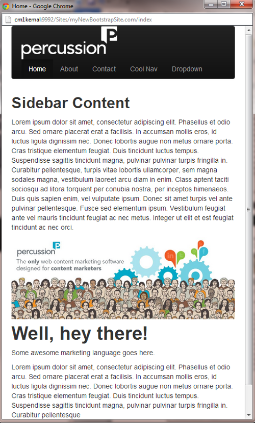
For example, you can pick and choose what content in your template should be displayed on mobile vs. tablet vs. desktop simply by applying Twitter Bootstraps Responsive Utility Classes to certain regions within CM1. Here, we are adding the hidden-phone class to the Sidebar to hide the entire sidebar on phone size screens.

Step 4: Add widgets into your already bootstrap-styled regions then populate those widgets with content.
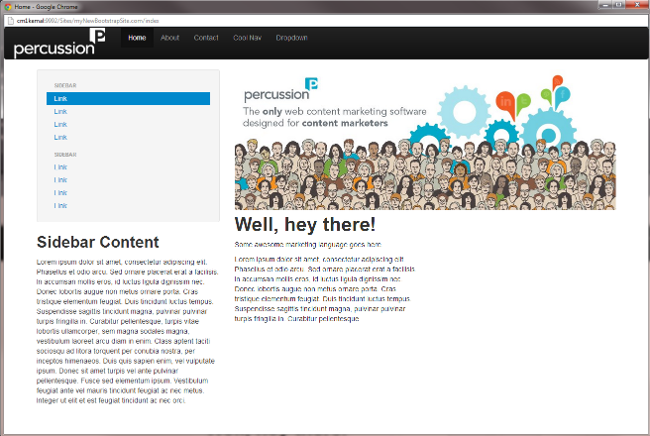
Step 5 Preview your pages and see how they respond to mobile and tablet browser sizes.


Note how the last screen size does not contain the Sidebar (it was set to be hidden on phone sizes).
Percussion CMS gives you the power to utilize plug and play, powerful and Mashable web technologies such as Twitter Bootstrap on your web site without requiring you to build new implementations, learn new markup languages or write new connectors or controls. You can simply put the right files in your theme, make the references and you are good to go. Now you can get back to cranking out content in your CMS.
