Image Auto-List Widget
The Image AutoList widget creates and displays an automated list of image assets. The list only selects image assets; flash image assets and file assets are not selected even if their files are in image format.
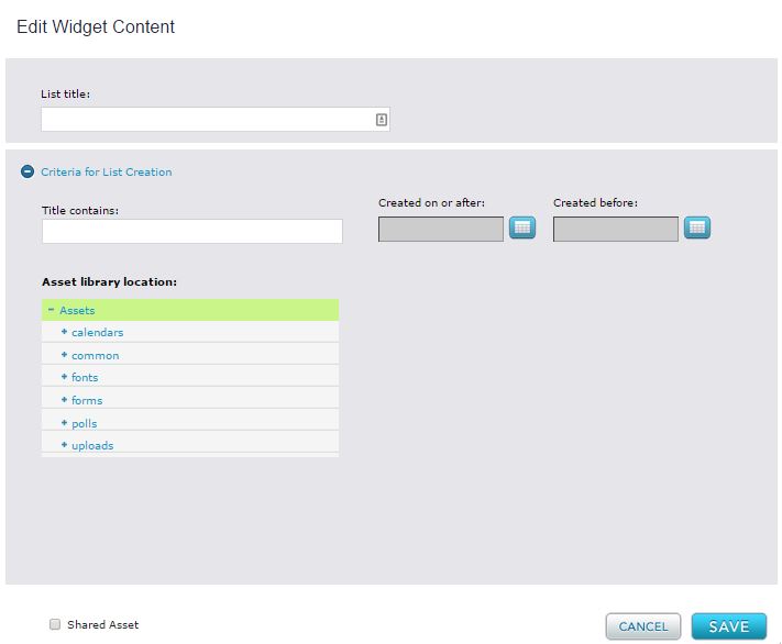
The widget selects images according to filters that you define by entering values or selecting options in the Criteria for List Creation in the widget editor.
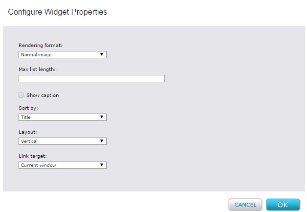
Widget Configuration Properties
Rendering Format - Dropdown list with options that indicate how the images in the autolist are rendered. Choices are:
- Normal image - (default) full-sized images;
- Thumbnail - thumbnail images;
- Thumbnail link - linkable thumbnail images; when clicked the thumbnails open full-size images.
Max list length – Maximum number of images that can appear in the list. Default is null, which indicates that all matching elements are included in the list.
Show caption - Checkbox used to specify whether the value of the Link title field entered in the image asset's metadata will be included in the list published on the page.
Note that if you check this box, but an image asset's Link title field is blank, the list will not display a caption for that image asset. To add a caption, open the image asset, and fill in the Meta-data > Link title field.
Sort by - Drop list of options for sorting the images in the list. Choices are:
- None - (default) Images appear in the order that they are selected for the list.
- Title - Images are sorted alphabetically by title.
- Latest Date - Images are sorted by system create date, from most recent to least recent.
- Earliest Date - Images are sorted by system create date, from least recent to most recent.
Layout – Drop list of options for displaying the list of images on a page. Choices are:
- Vertical - Default. List runs top to bottom.
- Horizontal - List runs left to right.
Note: This setting only applies for the default Percussion theme. For custom themes, additional CSS will be needed. Reference the perc-list-vertical and perc-list-horizontal styling in the default theme (perc_theme.css) as a model that will work with this configuration option.
Link target – Drop list that indicates whether a full image accessed by a thumbnail link is shown in the same browser page or a new browser page. Options are:
- Current Window - (default) Image is shown in the same browser page.
- New Window - Image is shown in a new browser page.
Widget Editor
List title - Name that appears at top of list
Title Contains - A string that must be included in a selected image's title.
Created on or after - The selected image must have a system create date on or after this date.
Created before - The selected image must have a system create date before this date.
Asset library location - A tree of the Asset library. If you select a folder in the tree, the query searches for images in that folder and all of its descendant folders.
Widget Style Properties
CSS root class – the CSS class that you want to apply to the list as a whole.
CSS image list class - the CSS class that you want to apply to images in the list.
CSS thumbnail link class - the CSS class that you want to apply to thumbnail links if they are included in your list.
CSS caption class - enter the CSS class that you want to apply to image captions if they are included in your list.


