Image Widget
The Image widget lets you place and edit an image on a page or template. You can add an image to the widget either by:
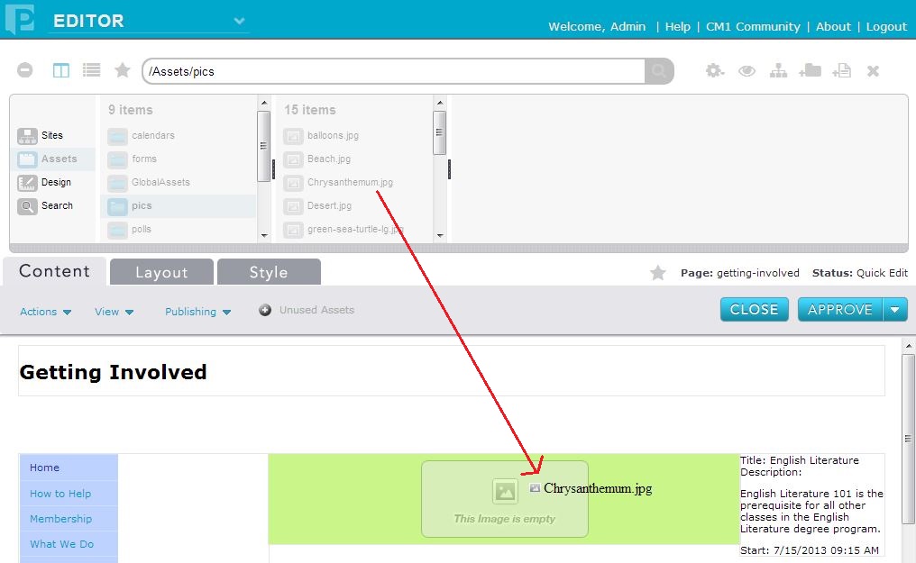
1) Dragging and dropping an Image asset from the Finder onto the widgetWhen you upload an image into the widget, Percussion creates a shared Image asset. Note that when you delete an image from a page or template, the asset remains in the Finder; however, when you delete an asset from the Finder, the image is removed from all pages and templates that contain it.
When an image is uploaded, a thumbnail image is also created (but does not appear as a separate asset in the Finder). You can choose either to display the full-sized image or the thumbnail image on the template or page.
Widget Configuration Properties
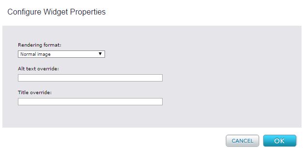
Rendering Format - Choices are:
- normal image - Default. Page or template displays the full-sized image.
- thumbnail and lightbox - Page or template displays a thumbnail image that the web visitor can click to view the full-sized image in a light box.
Alt Text Override - Text entered overrides the Alt Text stored by the Image asset.
Title Override - Title entered overrides the Title Text stored by the Image asset.
Widget Editor
You use the widget editor only when you want to upload a file from you local computer or network to the Percussion CMS. If you want to use an image that has already been added to the CMS you simply drag and drop the image from the finder to the Widget.
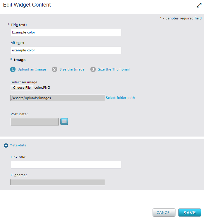
Title Text - Required. Name of Image asset that is stored in the system.
Alt Text - Text displayed on page or template if image cannot be rendered.
Image - Select the image from your local computer or network that you want to upload. Once it has been uploaded the image will display and you can resize the image and thumbnail. If you selected the wrong image, you can click on the "upload an image" link again to select a different image.
Select Folder Path: Select the destination folder path in which to upload the image to. This dialog only appears when adding content to a new image widget.
In the Meta-data section, you can also designate the default link text that is used when linking to this asset in a page. the folder name and file path will be displayed once the asset is saved.
Widget Style Properties
CSS Root Class - A text box in which you can enter a CSS class that you want to apply to the rendered content. The styling in this class overrides any widget styling specified in the theme CSS. Your site designer can provide you with the class name.


